Kelvin Kyere — Half Design, Half Development

FrontendDesigner
HalfDesignHalf
Development
V2.0Scroll to exploreTema, Ghana

Kelvin

CURIOUS ENOUGH TO START THINGS,
STUBBORN ENOUGH TO FINISH THEM,
DISTRACTED ENOUGH TO OPEN 14 TABS.

Kyere

DESIGN, CODE, BRANDING, & RANDOM IDEAS
MOST DAYS I’M JUST TRYING TO MAKE
THEM ALL GET ALONG.

Kelvin Kyere

About Me

My name is Kelvin Kyere, a frontend-focused developer based in Tema, Ghana, with a thing for clean interfaces, thoughtful details, and turning rough ideas into working digital experiences.

I work across websites, web applications, WordPress, branding, and digital products, with a growing focus on building polished frontend experiences backed by solid development.

Got something that might challenge me? I'm listening.
Selected work

Independent projects / 01–03
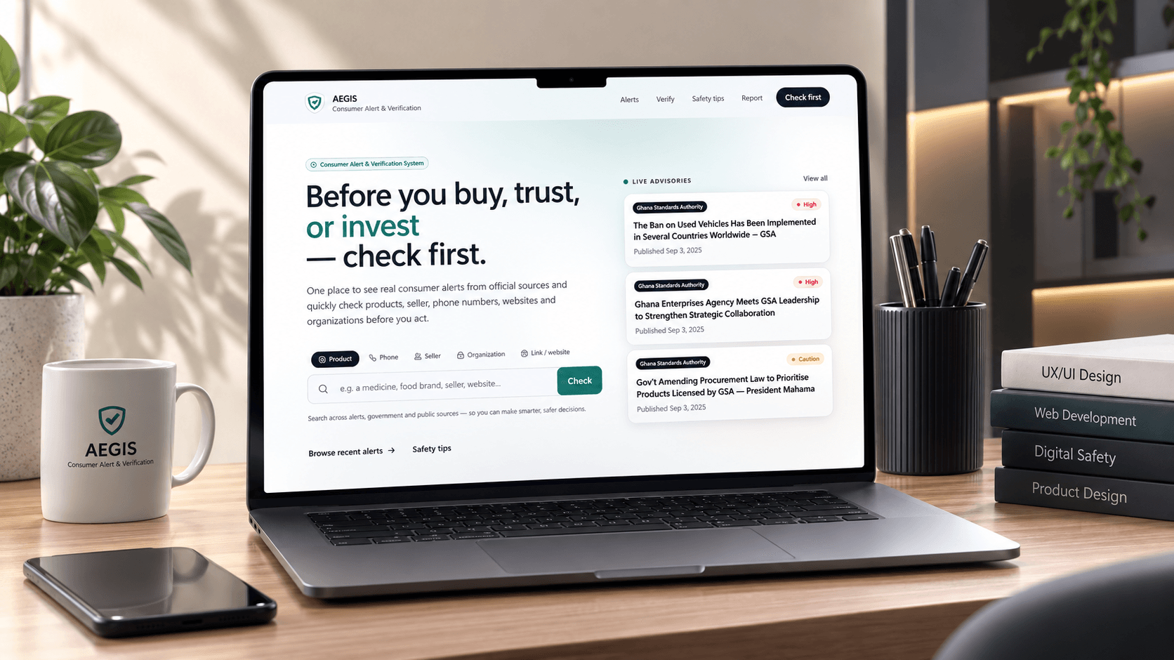
AEGIS consumer alert platform shown on a laptop
01 / 03

AEGIS

[VIEW PROJECT +]
Discipline
Web & mobile application
Built with
Next.js / Node.js / PostgreSQL / Flutter
My role
Lead / Full-stack developer

A consumer alert system that brings safety information, verification and reporting into one place.
Selected work — 01 / 2026

AEGIS

Consumer safety.
A clearer place to start.

A web and mobile platform for discovering safety alerts, checking potential risks, and reporting concerns for review.

View live project
Role
Lead / Full-stack developer
Context
Final-year university project
Platforms
Web & mobile application
Team / Year
3 people / 2026
One system. Two everyday experiences.
aegisalerts.online
AEGIS web verification interface with six categories and a search field
Mobile verification
Mobile verification
AEGIS / Consumer Alert System
01 / The problem

Useful information.
Too many places to look.

Consumer safety information is spread across agencies and platforms. Finding a relevant alert quickly can be difficult, and reporting a concern is a separate journey again. As a team, we set out to bring those experiences into one clear, accessible system.

01

Scattered information

Alerts arrive from different sources, without a single starting point.

02

Hard-to-find updates

Important notices need to be easy to discover and understand.

03

A reporting gap

Consumers need a clear way to submit concerns for review.

aegisalerts.online
Live AEGIS homepage with search categories and official-source advisory cards
01 — The public website / Check before you act
02 / My contribution

From requirements
to a working product.

I led the technical implementation within our three-person team, working primarily across the web application, backend architecture and system integration. My role was to translate our project requirements into a working product and coordinate the technical direction of the build.

Web developmentBackend architectureSystem integrationTechnical direction
03 / The solution

Check. Discover.
Report.

AEGIS connects a consumer-facing experience with an administrative review workflow. Users can discover alerts and raise concerns; the review step keeps a submitted report distinct from a published advisory.

Verification

Choose a product, phone number, business, organization, website or app before starting a check.

Source-led alerts

Browse advisories with source attribution and visible status information.

Consumer reporting

Provide the category, incident details and supporting evidence through a focused reporting flow.

Review before publication

Reports go through moderation before they can inform public-facing information.

aegisalerts.online
AEGIS reporting page with anonymous tip and signed-in report options
04 / The mobile experience

A considered flow.
One step at a time.

The mobile application carries the same intent into a compact interface: choose what to check, identify a concern, add the details, and attach evidence. Persistent navigation keeps the main actions within reach.

01 / Run a safety check
02 / Choose a category
03 / Describe the incident
04 / Attach evidence
05 / Interface direction

Clarity, without
the alarm.

Strong hierarchy, restrained colour and familiar cards help make serious information approachable. Category controls guide the first action, while concise labels and generous spacing support scanning on smaller screens.

Hierarchy / Interface studyAa

Check first.

Clear headings.
Quiet supporting details.
A visible next step.

Deep teal#194F50
Soft mint#E9F3F1
Off-white#F7F9F8
Presentation palette drawn from the supplied app screens.
06 / Under the surface

Different interfaces.
A connected system.

The project brings web, backend, database and mobile development together. The central challenge was keeping those experiences connected while preserving a clear boundary between submitted reports and reviewed information.

Web
Next.js
Backend
Node.js
Database
PostgreSQL
Mobile
Flutter
07 / Outcome & reflection

A complete project.
A broader perspective.

AEGIS became one of my most comprehensive university projects, bringing together frontend, backend, database and mobile work. It reinforced how much thoughtful interface design matters when people need to understand information quickly.

01Design the system before the screens.

02Let the data structure inform the interface.

03Learn from the product beyond the mockup.

View live project
AEGIS — Consumer Alert System / 2026
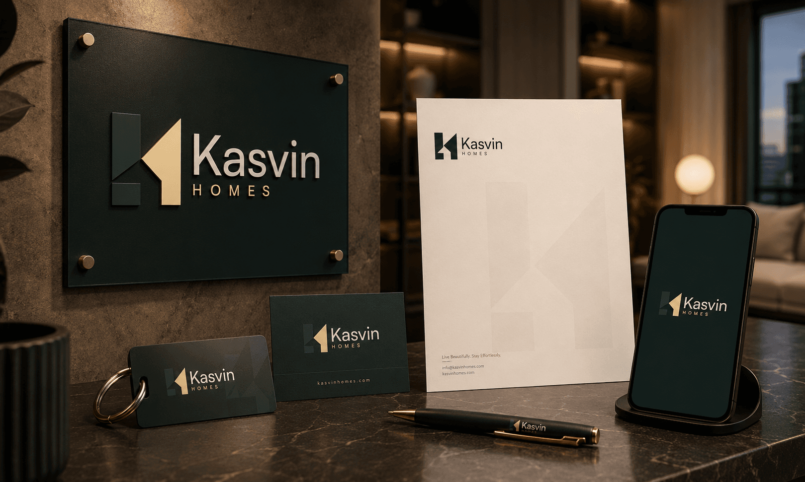
Kasvin Homes brand identity
02 / 03

Kasvin Homes

[VIEW PROJECT +]
Discipline
Brand identity
Built with
Logo / Visual identity / Brand guidelines
My role
Brand designer / Art director

A complete brand identity system for a modern hospitality brand.
Selected work — 02 / 2026

KASVIN
HOMES

Brand Identity for a
Modern Hospitality Brand

A refined identity for a short-stay apartment brand designed around comfort, simplicity and a sense of home away from home.

Type
Brand Identity
Industry
Hospitality / Short-Stay Accommodation
Role
Brand Designer
Deliverables
Logo, Visual Identity, Typography, Color System, Brand Applications
Brand identity / Visual systemKasvin Homes brand mark on dark green backgroundKASVIN HOMES — Brand Identity
01 / The challenge

Welcoming enough
for guests. Polished
enough for business.

Kasvin Homes needed an identity that could feel welcoming enough for short-stay guests while still carrying the polish and credibility of a modern hospitality business. The brand had to work across digital platforms, physical signage, and room collateral — always feeling like home.

01

Warm

Guests should feel comfortable from the moment they arrive.

02

Refined

Premium, but not luxury-for-the-sake-of-luxury.

03

Timeless

Something that could grow beyond one apartment.

02 / Logo concept

An architectural
approach to home.

The identity uses a restrained architectural approach, balancing the familiarity of home with a more polished hospitality aesthetic. The K mark is constructed from geometric building blocks — a strong vertical and horizontal structure forms the base, while a diagonal cut shapes the letter K. The negative space between forms creates the letter H, and the solid foundation represents stability and grounding.

Geometric gridModular systemScalable mark
Kasvin Homes brand guidelines
03 / Visual system

Grounded
in nature.

The palette draws from natural tones — deep pine green for authority, warm sand for approachability, and off-white for clarity. Each color has a role: green anchors the brand, sand illuminates, and off-white provides breathing room. The primary typeface Satoshi is a Swiss-style modernist sans-serif — geometric, modern, clean, and confident.

Typography / Primary typefaceAa

Satoshi

A Swiss-style modernist sans-serif.
Geometric / Modern / Clean / Confident.

Pine Green#1E3B34
Sand#FAE3AF
Off-White#F2F1EB
Primary palette from brand exploration.
04 / Symbol logic

Built from
building blocks.

The mark is deconstructed into its essential elements: structure, the letter K, the letter H, and foundation. Strong vertical and horizontal lines form the structural base. The diagonal cut shapes the letter K within the structure. The negative space and right form create the letter H. The solid base represents stability and grounding.

Kasvin Homes K mark grid constructionGrid construction
Kasvin Homes K mark iconIcon only
05 / Brand experience

From arrival
to checkout.

The identity extends across the entire guest journey — from the first touchpoint on Airbnb to the moment they leave. Every interaction feels considered, every detail reinforces the brand.

Arrival

Signage / Welcome

The first impression. Illuminated exterior signage sets the tone before guests even step inside.

Stay

Room collateral / Guest materials

Everything a guest needs — welcome cards, door hangers, key cards, coasters, and scented candles.

Booking

Website / Airbnb / Social

Digital presence that converts. From listing cover to Instagram, the brand stays consistent.

Kasvin Homes exterior signage mockupExterior signage — first impression
Kasvin Homes room collateral mockupRoom collateral / Guest materials
Kasvin Homes welcome experience mockupWelcome experience / Digital display
Kasvin Homes social media templateSocial presence — Instagram / Airbnb
06 / Closing

A brand designed to feel
like home before you
even arrive.

Kasvin Homes gave the company a visual language that matches their approach — personal, considered, and built to last. The geometric mark provides a flexible foundation that works across every context, from favicon to facade.

01Great brands start with understanding the people behind them.

02Restraint is a design decision — what you leave out matters.

03A good mark works at every scale, from favicon to facade.

KASVIN HOMES — Brand Identity / 2026
Grains Depot brand identity
03 / 03

Grains Depot

[VIEW PROJECT +]
Discipline
Brand identity
Built with
Logo / Visual identity / Packaging
My role
Brand designer

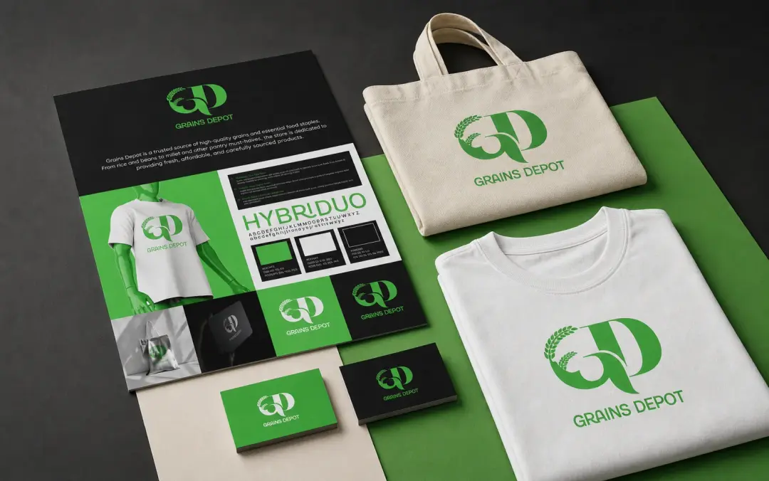
A visual identity for a provisions business offering everyday food and household essentials.

Selected work — 03 / 2026

GRAINS
DEPOT

Brand Identity /
Retail & Wholesale

A visual identity created for a provisions business offering everyday food and household essentials, from rice and cooking oil to sugar and other staple goods.

Type
Brand Identity
Industry
Retail & Wholesale / Provisions
Role
Brand Designer
Deliverables
Logo, Visual Identity, Packaging, Brand Applications
Brand identity / Visual systemGrains Depot brand mark on dark backgroundGRAINS DEPOT — Brand Identity
01 / The challenge

Dependable, familiar
and professional.

Grains Depot needed an identity that felt dependable, familiar and professional without looking like an agricultural brand. The goal was to create a visual system that could work across storefront signage, packaging, delivery materials and everyday customer touchpoints.

01

Dependable

A business customers can trust for everyday essentials.

02

Accessible

Friendly and familiar, not overly premium or corporate.

03

Versatile

Able to work across bags, cartons, signage, receipts and digital platforms.

02 / Logo concept

Rooted in
everyday trust.

The GD monogram wraps the brand's initials in a flowing, organic form — a subtle nod to grain stalks without leaning into agricultural clichés. The leaf element adds warmth and life, while the bold wordmark below grounds the mark in clarity and confidence.

Organic formsMonogram systemScalable mark
Grains Depot brand guidelines
03 / Visual system

Fresh, bold
and ready.

The palette is built for shelf presence — a vibrant green signals freshness and trust, while black and white provide contrast and versatility across packaging, signage and digital. The typography is clean and direct, designed to read clearly on sacks, cartons and receipts alike.

Typography / WordmarkGD

Grains Depot

Bold, clean, and unmistakable.
Designed for shelf and storefront.

Vibrant Green#4CAF50
Deep Black#1A1A1A
Off-White#F5F5F5
Primary palette for retail and wholesale applications.
04 / Brand application

From storefront
to doorstep.

The identity extends across the entire retail and wholesale journey — from the moment a customer sees the signage to the bag they carry home. Every touchpoint reinforces the brand.

Grains Depot brand collateral mockupBrand collateral — tote, tee, business cards
Retail

Storefront / Packaging

Signage, branded bags, rice sacks, cooking oil labels, and cartons that stand out on the shelf.

Wholesale

Delivery / Invoices

Delivery vans, aprons, receipts, and price lists that keep the brand consistent at scale.

Digital

Social / WhatsApp

Catalogue posts, social media templates, and digital presence that converts.

05 / Closing

Built for the shelf,
the store and everything
in between.

Grains Depot now has a visual language that matches their approach — dependable, accessible, and built to work across every context from storefront signage to the bag a customer carries home.

01Retail brands need to work hardest at every scale.

02Familiar doesn't mean forgettable — it means trusted.

03A good identity works on a sack of rice as well as a business card.

GRAINS DEPOT — Brand Identity / 2026
Selected explorationsScroll to explore ↓

What I Do

01 / 05

Website Development

  • / Frontend Development
  • / Backend Development
  • / Landing Pages
  • / Business Websites
  • / Responsive Websites
02 / 05

Art Direction & Visual Design

  • / Visual Identity
  • / Logo Design
  • / Graphic Design
  • / UI / UX Design
  • / Video Editing
03 / 05

CMS & E-commerce

  • / WordPress
  • / Shopify
  • / Strapi
  • / E-commerce Websites
  • / Custom CMS Solutions
04 / 05

Web & Mobile Applications

  • / Web Applications
  • / Admin Dashboards
  • / SaaS Interfaces
  • / Mobile Applications
  • / API Integrations
05 / 05

Digital Products & Templates

  • / Website Templates
  • / Email Templates
  • / UI Templates
  • / Brand Assets
  • / E-books & Guides

My Skills

The tools I reach for when turning ideas into something real.

  • HTML
  • JavaScript
  • TypeScript
  • React
  • Next.js
  • Tailwind CSS
  • GSAP
  • Lenis

Moving image gallery. Move the pointer left or right to steer. Use left and right arrow keys to browse, or Space to pause and resume.

Got something that might
challenge me?
Aegis project
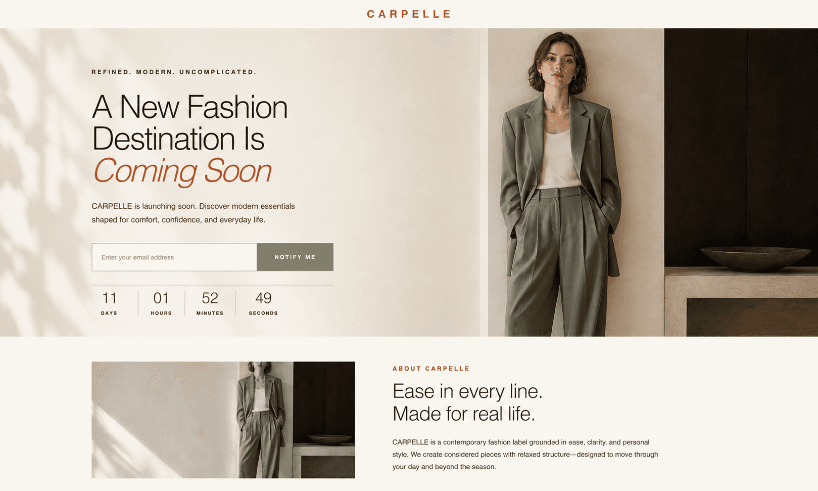
Carpelle project
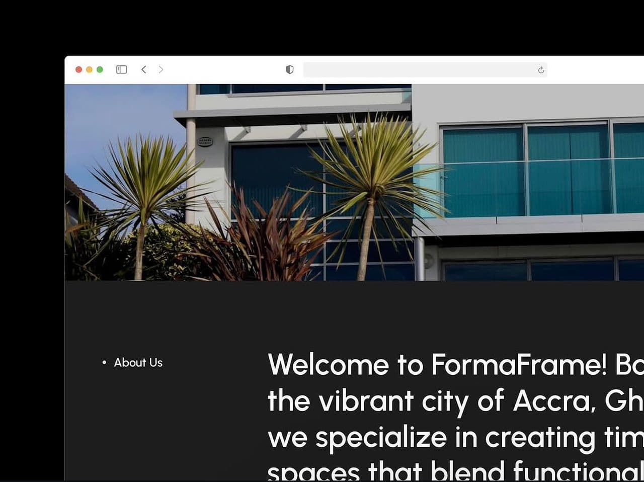
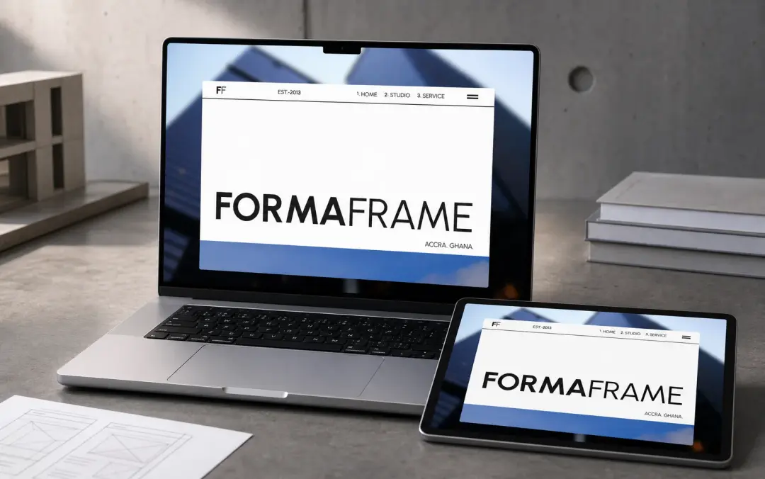
Forma project
Grains Depot project
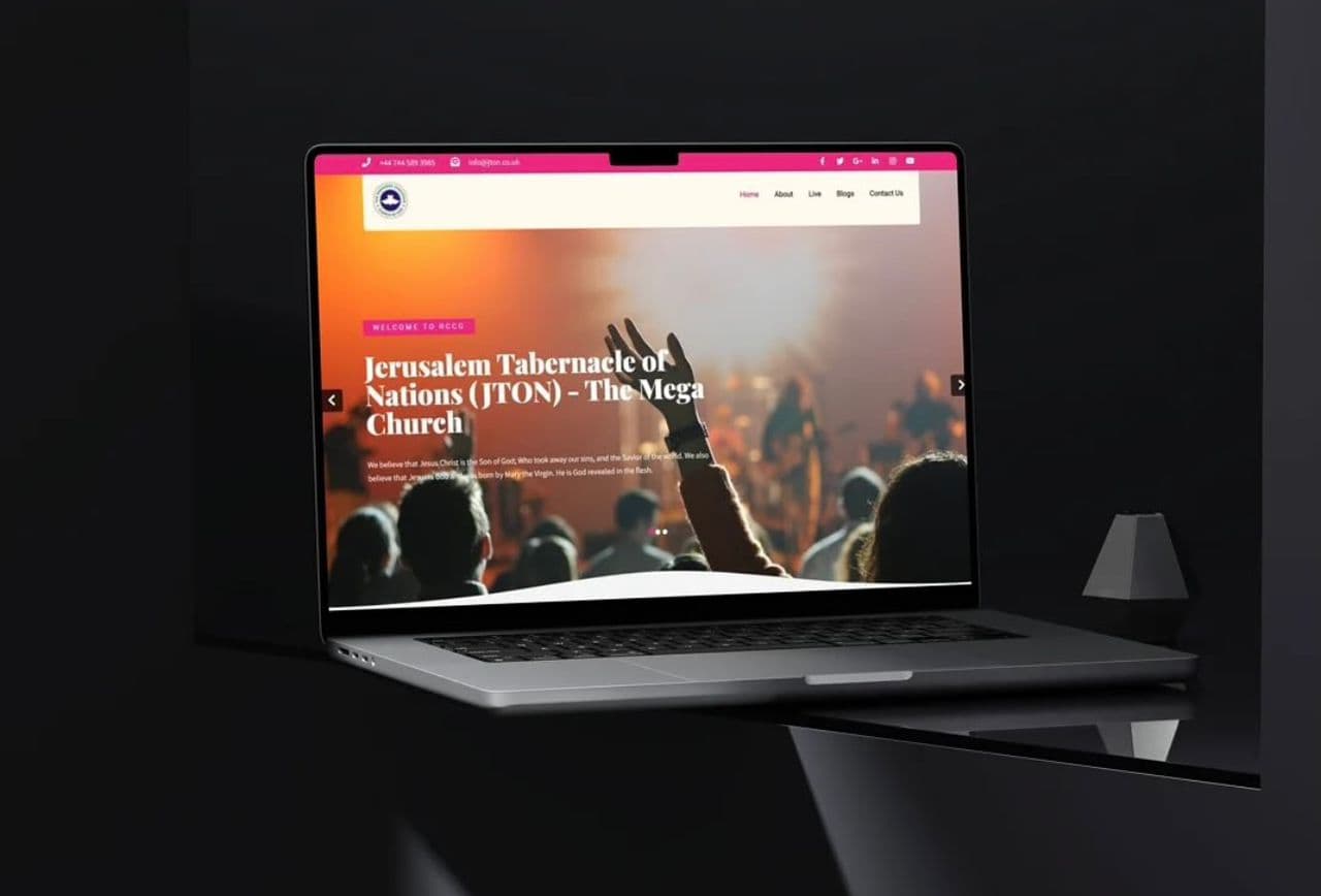
Jton project
Kasvin project

I'm listening.

Contact Me